Painterʼs lake house丨Between The Walls
Between The Walls ,Release Time2023-04-21 11:07:22
Copyright Notice: The content of this link is released by the copyright owner Between The Walls . designverse owns the copyright of editing. Please do not reproduce the content of this link without authorization. Welcome to share this link.
版权声明:本链接内容均系版权方发布,版权属于Between The Walls,编辑版本版权属于设计宇宙designverse,未经授权许可不得复制转载此链接内容。欢迎转发此链接。
Copyright Notice: The content of this link is released by the copyright owner Between The Walls. designverse owns the copyright of editing. Please do not reproduce the content of this link without authorization. Welcome to share this link.
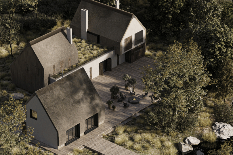
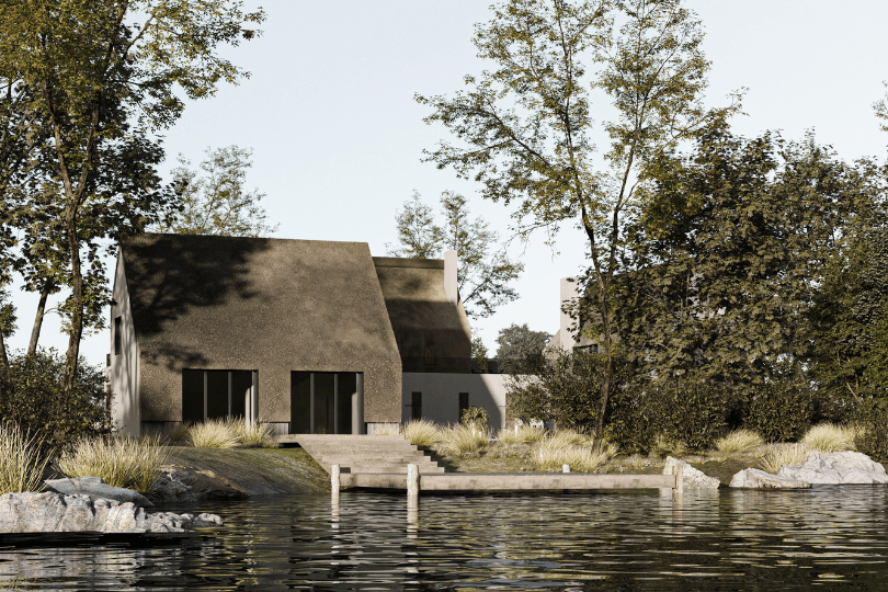
The site itself, the cardinal directions, and the location of “save” points such as trees and a well impose their own design restrictions.
We moved away from the original parallel arrangement of buildings and deliberately moved the Workshop so that it does not interfere with the view of the lake from the main house.
The buildings on the site were located as close as possible to each other so that access to the working area was quick and convenient.
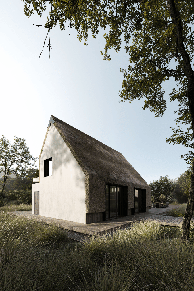
In the common house, the building was zoned in such a way that the private areas of each family are as far away from each other as possible. But at the same time, they are connected by a large, comfortable, common area.We made the main room of the workshop open, with the possibility of dividing it in the form of a screen or thick curtains. From the working space, there is an exit to the terrace to relax and admire nature and the view of the lake. From the second level, thanks to the transfer of the roof ridge, we managed to make additional lighting for the working area. Since the glazing with access to the terrace has a North direction, the upper windows are an integral functional attribute of the building. The roof from the side of the terrace is led up to the wall so that you can literally touch it and feel the connection with the distant past.

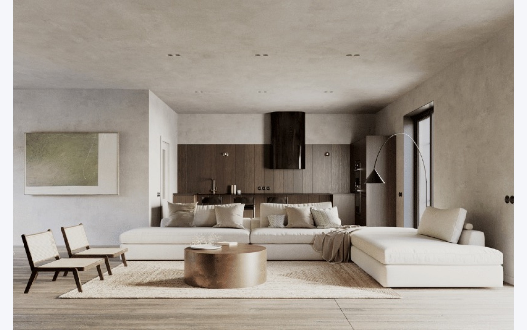
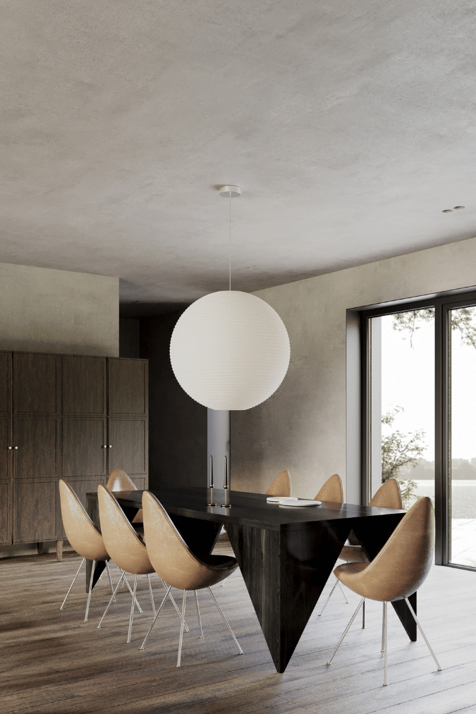
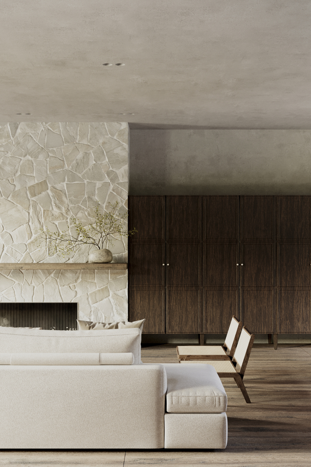
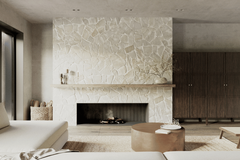
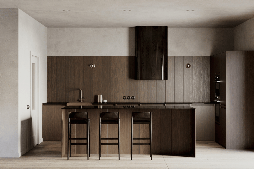
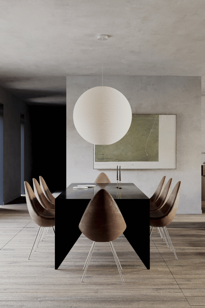
In the common area, we designed a large kitchen where 2 families can cook even in parallel and an island in order to communicate with each other. Separately placed a large dining table overlooking the courtyard. And a voluminous soft zone with sofas and a fireplace to relax nearby and spend time informally.
We also made a room for food supplies, as we appreciated the closest accessibility to grocery stores.
As for personal spaces, it was decided to make them different, so that it would be possible to choose where to settle the family based on its composition. Also, due to the variety of planning solutions, we have more interesting building from the outside.
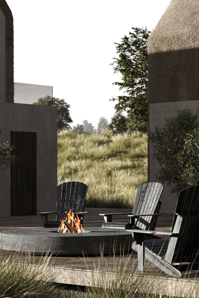
Relying on the task of preserving the population of bats in this region, we placed the roofs at a large angle, which allowed us to proportionally stretch the architecture vertically and gave us the place we needed to place the bats. Since they need darkness and warmth, this is the best place to house them.

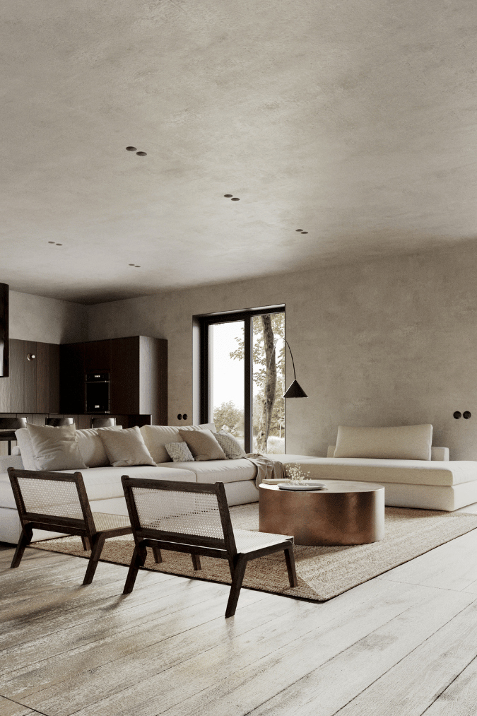
The whole intention of the appearance was to show modern, minimalist architecture with its lightness, regular lines, predictable functionality and at the same time pay tribute to the past with volumetric roofing made of natural materials and ecological finishing of facades.
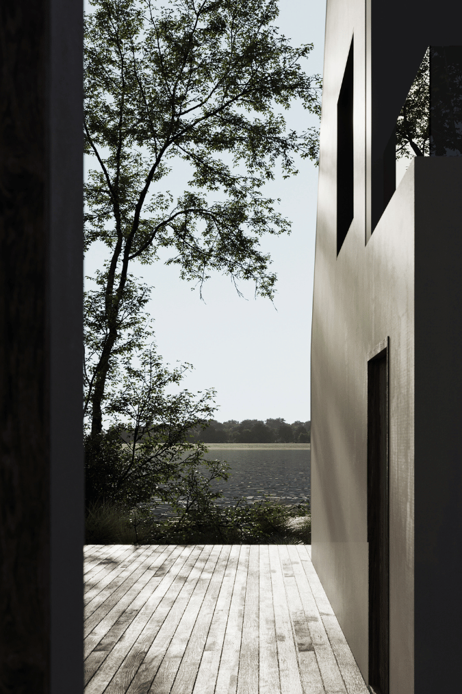
On the roof between two separate private areas, it is possible to have an outdoor barbecue or simply relax together or in privacy.
之外民宿丨素造建筑
Sōko | CAAM (Architect Camilo Moreno Oliveros and Architect Daniel Moreno Ahuja)
戈尔德国际广场 | POA建筑事务所
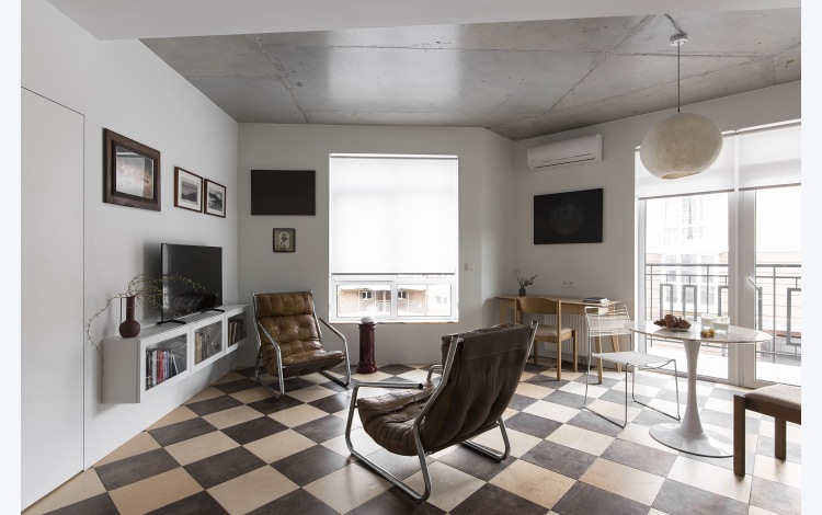
Takoye丨Between The Walls
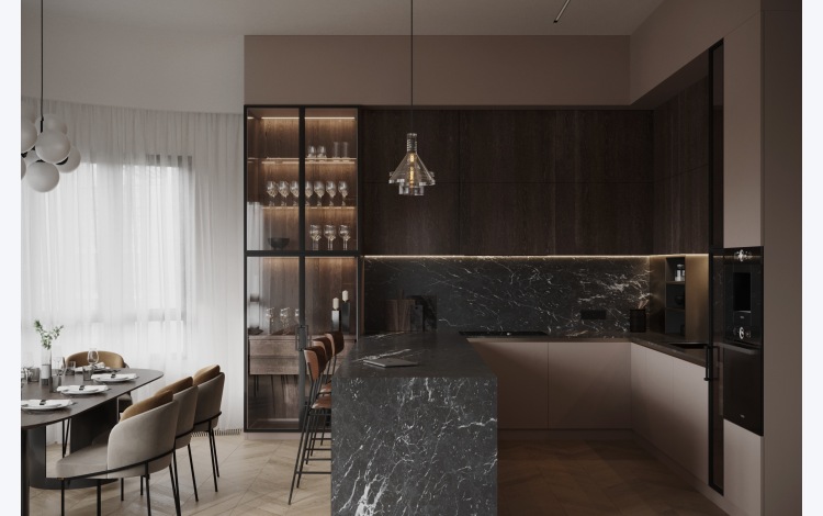
Single Malt丨Between The Walls
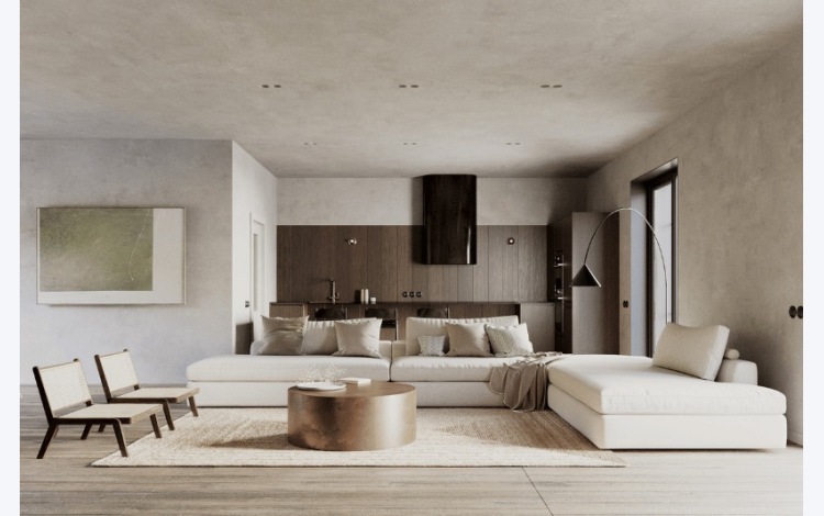
Painterʼs lake house丨Between The Walls

MOFUN
The Peach Club丨Spaces and Design

House with 5 retaining walls | 武田清明建築設計事務所

Subscribe to our newsletter
Don't miss major events in the global design industry chain and important design resource companies and new product recommendations
Contact us
Report
Back to top


